Is a Track Record Carried by One Year? The Two-Minute Check
A compound annual return is an average, and averages hide concentration. Here's how to test whether a decade-long track record rests on a single extraordinary year — worked on a chart that, unusually, shows you everything you need to run the test.
Start by giving this chart credit
Most results screenshots hide risk by omission. This one doesn't. It plots the strategy against its benchmark, adds a full drawdown panel underneath, and then breaks performance out year by year — including the years the strategy lost to the index. That is close to everything a reader needs, and it is rarer than it should be.
So this isn't a debunk. It's the opposite case, and a more useful one: what do you do when someone shows you good evidence? You read the part that answers the headline. Everything below came out of the poster's own third panel — we didn't need anything they didn't publish.
The claim attached to it was a question: whether an ML-driven mean-reversion model can return over 40% annually
. The chart says the compound rate is roughly that. The question worth asking is what shape that number has.
A compound average is not a typical year
A CAGR is one number standing in for a distribution, and it says nothing about how evenly the return arrived. Two strategies can both compound at 39% a year: one earns 39% every year, the other earns 20% nine times and 400% once. They are completely different products with completely different futures, and the equity curve on its own cannot tell them apart — especially on a log scale, which is designed to make steady compounding look straight.
The annual-returns panel can tell them apart. So read that one first.
Read the annual panel, not the equity curve
Measured off the posted chart, the eleven years look like this. The benchmark column doubles as a check on our own measurement: it lands on −18.0% for 2022 and +29.9% for 2019, within a point or so of the real index, so the readings are sound.
| Year | Strategy | Benchmark | |
|---|---|---|---|
| 2014 | +19.3% | +11.3% | |
| 2015 | +83.1% | +1.4%* | |
| 2016 | +29.9% | +8.6% | |
| 2017 | +19.3% | +19.3% | |
| 2018 | +8.6% | −2.0% | |
| 2019 | +19.3% | +29.9% | |
| 2020 | +309.3% | +16.6% | the year that carries the record |
| 2021 | +24.6% | +27.3% | |
| 2022 | +29.9% | −18.0% | |
| 2023 | +3.3% | +24.6% | |
| 2024 | +24.6% | +16.6% |
* the 2015 benchmark bar was too small to measure off the image; the real figure is about +1.4%.
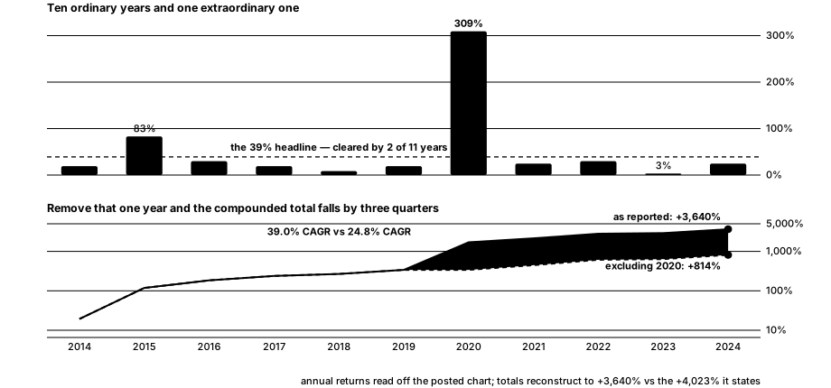
One year returned +309%. The other ten sit between +3.3% and +83.1%. Only two of eleven years cleared the 39% headline, and the median non-2020 year was +24.6%. The number in the caption is not a year anyone actually had.
Drop the best year and re-compound
That's the whole test, and it takes two minutes: set the outlier year to zero, compound the rest, and compare.
- As reported: +3,640% over eleven years — a 39.0% CAGR.
- Excluding 2020: +814% — a 24.8% CAGR.
Removing a single year out of eleven takes about three quarters of the final total with it. That is the definition of a concentrated record, and it reframes the original question precisely: can this model return over 40% a year? It did, once, in 2020 — and the honest expectation for a normal year is closer to 25%.
It also matters which year. 2020 was the COVID crash and the rebound out of it: the highest-volatility, fastest-reverting tape in modern market history, and the single most favourable environment a mean-reversion model has ever been handed. A strategy's best year is rarely random — it usually names the regime the strategy needs, which tells you what you're really buying.
What this does and doesn't mean
It does not mean the strategy is weak or the chart is misleading. Strip out its best year entirely and it still compounds at 24.8% against the index's 11.4%, with a maximum drawdown of about −19% against the index's −34%. Higher return and shallower drawdowns over eleven years is a genuinely good result, and it survives the harshest version of this test.
What the exercise establishes is narrower: the headline is carried by one year, and the typical year is about 25%, not 40%. Someone sizing a position off 40% annually
is planning around a number that occurred once, in conditions that may not repeat. That's worth knowing before you allocate, and it's a criticism of the framing rather than of the work.
Worth noting too: the strategy beat its benchmark in only 7 of 11 years. A record can be excellent overall and still lose to the index more than a third of the time — which is the tracking error you'd have to sit through to collect it.
The checklist
- Find the annual-returns panel before the equity curve. The curve shows the total; only the yearly breakdown shows whether it arrived evenly.
- Count how many years actually cleared the headline rate. Here it was two of eleven.
- Zero out the best year and re-compound. If the total collapses, the record is concentrated and the CAGR is a poor guide to a normal year.
- Take the median year, not the mean. It's the number closest to what you'd actually experience.
- Ask what the best year had in common. A strategy's standout year usually identifies the regime it needs — and tells you when it will disappoint.
- Count the years it lost to the benchmark. That's the tracking error you have to tolerate to hold it.
- Compare drawdowns, not just returns. Shallower drawdowns than the index are worth as much as the excess return, and a good chart shows both.
What we can't tell you
Our figures are read off a small posted image, so every annual number carries a point or two of error — which is why we show the benchmark column as a check and why our reconstruction lands 10% below the stated total rather than exactly on it. None of that moves the conclusion: a 309% year is not a measurement artifact.
Beyond the picture, we can't see the trading costs assumed, the turnover, the universe, the position sizing, or — most important for anything described as machine learning — whether the model was retrained walk-forward or fitted once with hindsight over the whole period. That last question decides more about a track record than any figure on the chart, and no chart can answer it.
Questions, answered
How do you tell if a track record depends on one year?
Zero out its best year and compound the rest. On the record we measured, eleven years compounded to +3,640% as reported but only +814% with 2020 removed — a 39.0% CAGR falling to 24.8%. Losing three quarters of the total to one year out of eleven is what concentration looks like.
Why is a CAGR misleading on its own?
Because it's an average standing in for a distribution. A strategy earning 20% nine times and 400% once compounds to the same headline as one earning 39% every year, and the equity curve can't distinguish them — a log scale in particular is built to make uneven compounding look straight. The annual-returns breakdown is the panel that separates them.
Is a 24.8% CAGR without the best year still good?
Yes — very. That's more than double the benchmark's 11.4% over the same eleven years, with a maximum drawdown of roughly 19% against the index's 34%. The point of the exercise isn't that the strategy is weak; it's that the typical year is about 25%, not the 40% in the headline.
Why does it matter which year was the outlier?
Because a strategy's best year usually names the conditions it needs. Here it was 2020 — the COVID crash and rebound, the most volatile and fastest-reverting market in modern history, and the ideal environment for a mean-reversion model. That tells you both when it will shine and when it will disappoint.
Is this financial advice?
No. It's a worked example of testing a public track record for concentration. It isn't a recommendation about any strategy, model or trade.
Every figure on this page was measured off one publicly posted performance chart and re-compounded — with the benchmark series used as a check on the measurement — not supplied by the poster and not produced by our backtest engine. Educational information only — not investment advice. Hypothetical backtested results; past performance does not guarantee future results. Trading involves risk of loss.
Keep reading
Get the weekly edge report
The best-performing indicator per asset, what changed this week, and the honest caveats — straight to your inbox.