How to Read an Equity Curve Screenshot — the Chart With No Denominator
A rising cumulative-profit curve is the most persuasive and least informative artifact in trading. It shows a number going up while structurally omitting the one figure that would let you judge it.
The chart that shows profit and hides everything else
An equity curve — a platform's cumulative net profit
graph — is the most shared piece of evidence in automated trading, and the weakest. Every other artifact at least reports something about risk. This one plots a running total against time and stops there.
The example here is a real one, posted publicly: a cumulative curve for a futures strategy, running from January 2024 to the end of March 2026 and finishing near $133,000. We're not naming it — the failure mode belongs to the chart type, not the poster. Our figures are rebuilt from the posted image at a precision of roughly ±$307 per pixel, and we quote them that way rather than implying more.
Check the caption against the contents
The post's own words were: These are real backtests — wins, losses, drawdowns and everything in between. No cherry-picked trades. Just data.
That's a testable claim, because it lists exactly what should be on screen. Go through it item by item:
| What the caption promises | In the image? | What is actually there |
|---|---|---|
| “wins, losses” | no | No trade count, no win rate, no profit factor. |
| “drawdowns” | no | No drawdown figure anywhere on the chart. |
| “no cherry-picked trades” | n/a | No trades are shown at all — only their running sum. |
| “just data” | partly | One line. No account size, no costs setting, no run date, no settings. |
| “4 strategies” | no | One curve, with nothing saying whether it is one of them or all four. |
This isn't a gotcha about wording. Of every view the platform offers, cumulative net profit is the one that shows a running total and nothing else — so a caption naming wins, losses and drawdowns is attached to the single chart that displays none of them. When a caption describes risk and the image contains only reward, believe the image.
Rebuild the monthly numbers — they're recoverable
A curve is a picture of a series, and the series can be read back out of it. Sample the line at each month, difference consecutive values, and you have the monthly P&L the chart was built from — the view the poster didn't publish.
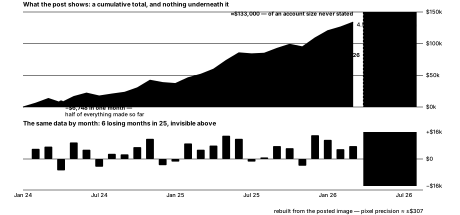
Six of the twenty-five months lost money — about 24%. That's a perfectly respectable figure, and it's worth saying plainly that the caption was right that this system has losing periods. But you had to reconstruct them, because a cumulative line renders a losing month as a slightly flatter slope. Cumulative charts don't hide losses by lying; they hide them by shape.
The give-back a cumulative chart flatters
The largest peak-to-trough on the curve is −$6,748, in April 2024. In the context of a chart that ends at $133,000 it's a barely visible notch. In the context of when it happened it erased 50.4% of everything the strategy had made to date — the running total went from $13,398 to $6,649.
Both descriptions are true, and that's the point: the same dollar drawdown shrinks visually as the total grows, so the riskiest stretch of a strategy's life is drawn at its smallest. Any curve that starts at zero will flatter its own early drawdowns this way.
And note what cannot be computed at all here: a real drawdown percentage. That needs account equity, and this chart plots profit. Without a starting balance, $6,748 could be 3% of the account or 30% — the figure the whole risk question turns on is simply not in the picture, and no amount of measuring recovers it.
Check where the window ends
The test stops at the end of March 2026. The post went up on 14 August 2026. That's roughly four and a half months between the last data point and the moment it was offered as evidence — shaded on the right of both panels above.
Extending a backtest to the present is the cheapest thing a person can do; it is one field in a dialog. So a gap at the recent end is worth a question, and the honest one is neutral: why does it stop there? Sometimes the answer is dull — a data subscription, a rebuild in progress. But the recent months are the ones most likely to be out-of-sample, which makes them the most informative and the most expensive to omit.
“Four strategies” is a selection problem, not a credential
The post advertises four automated strategies and shows one curve. Whether it's the best of the four or all four combined isn't stated, and the difference matters enormously.
This is the mechanism our own testing keeps running into: with enough candidates, something always fits the past. Across 660,005 backtests we found that 63% of assets had some indicator that beat buy-and-hold, while any single indicator managed it on only about 8–14%. That gap is selection, not skill — and building four systems and publishing the prettiest curve is the same operation on a smaller scale.
The period compounds it. January 2024 to March 2026 was a strong stretch for US equity indices, which is the easiest possible window for anything with a long bias. A curve that rises through it has not yet been asked a hard question.
The checklist
- Look for the denominator first. No starting balance means no return and no drawdown percentage — the two numbers that decide whether the strategy is any good. A dollar total alone is unfalsifiable.
- Read the caption as a checklist and tick items off against the image. Words like
drawdowns
andlosses
name things that either appear on screen or don't. - Difference the curve into periods. Monthly P&L is recoverable from any cumulative chart and shows the shape the line smooths away.
- Judge each drawdown against the equity at the time, not against the final total. Early give-backs look trivial at the right-hand edge and were not trivial when they happened.
- Check both ends of the window. A recent gap between the last data point and the post date is worth asking about; so is a start date that happens to begin a favourable regime.
- Count the candidates. One curve out of four systems is a selected curve. Ask what the other three look like.
- Ask what the platform charged. Backtesting tools default commission and slippage to zero, and a cumulative graph never shows the setting.
What an equity curve can never show you
Everything above comes from one image and describes that image. We can't see the account size, the contract count, the commission or slippage settings, the number of trades, whether the parameters were chosen after looking at this period, or what the other three strategies did. None of that is recoverable from a cumulative line at any resolution.
And the conclusion stays narrow, as it should: nothing here shows the strategy doesn't work. It may well. What the exercise shows is that this artifact cannot establish that it does — it has no denominator, it omits its own recent months, and it is one curve selected from four. Those are the grounds for asking better questions, not for reaching a verdict.
Questions, answered
What's wrong with a cumulative profit chart?
It has no denominator. Profit in dollars can't be turned into a return or a drawdown percentage without the account size, and a cumulative graph never shows it. The same $6,748 loss is trivial on a large account and severe on a small one, and the chart cannot tell you which.
How do you find the monthly returns from an equity curve image?
Sample the curve at each month and difference consecutive values — the monthly P&L is fully recoverable from the picture. Doing that to the curve we audited turned a smooth-looking line into six losing months out of twenty-five, which the cumulative view renders as nothing more than a flatter slope.
Why does an early drawdown matter more than it looks?
Because a cumulative chart draws every drawdown at the same dollar height while the total beneath it grows. The largest give-back on this curve was $6,748, a small notch against a $133,000 finish — but at the moment it happened it wiped out 50.4% of everything the strategy had earned.
Is it a red flag if a backtest ends months before it's posted?
It's a question, not a verdict. Extending a backtest to the present is trivial, so a four-and-a-half-month gap between the last data point and the post is worth asking about — especially because the most recent months are the ones most likely to be genuinely out-of-sample.
Does showing four strategies make results more trustworthy?
Not by itself — it can mean the opposite. Publishing one curve out of four is a selection, and selection is exactly how backtests flatter themselves. In our own testing, most assets had some indicator that beat buy-and-hold while any single indicator managed it only about 8–14% of the time.
Is this financial advice?
No. It's a worked example of reading a public equity-curve screenshot. It isn't a recommendation about any strategy, product or trade.
Every figure on this page was rebuilt from one publicly posted equity-curve image by measuring the line against its own axes, at a precision of about ±$307 per pixel — not supplied by the poster and not produced by our backtest engine. Educational information only — not investment advice. Hypothetical backtested results; past performance does not guarantee future results. Trading involves risk of loss.
Keep reading
Get the weekly edge report
The best-performing indicator per asset, what changed this week, and the honest caveats — straight to your inbox.